The
 blog
blog
What makes a good viz? - Part 2
25th August 2017 | Chris O'Mahony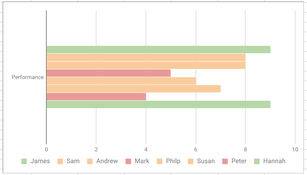
Question complexity
Every addition in complexity to a visualisation should add value. For every extra dimension or measure that is added to a visualisation, the user will require more time and thought to process the information that is being presented to them. If that added complexity does not add value to the message of the visualisation or dashboard, this is essentially wasted time. As a general rule of thumb, do not do one thing in two different ways on the same single visualisation. For example, a bar chart showing Students by academic achievement, does not need the bars coloured by academic achievement as this doesn’t add any additional value.
Consider your user
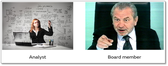
Consumers for published dashboards and reports can vary dramatically. Some users will be happy to delve into the details of issues and have the time and inclination to do so, whereas others will just require figures represented at a high level and immediately digestible.
Consistency
When creating a dashboard, ensure that consistency is applied, particular in relation to colours. If a colour palette is used somewhere within your dashboards to represent something, it should be used elsewhere to represent same element. If this cannot be followed, ensure that legends are placed in appropriate positions, so that the colour identification is clear.
Colour Sequencing
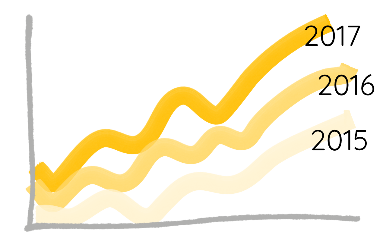
If using colours across a sequence, such as a number of years, use sequential colours rather than a random colour palette. This should make it easier for the user to intuitively interpret the data and the dimensions it describes.
Signpost functionality
It is very easy when you are creating a dashboard to know how everything interacts and what behaviour is to be expected. However, for a new user approaching a dashboard cold, this can often be a tricky process. It is best to offer some kind of guidance on the dashboard to functionality or features that they may not be expecting.
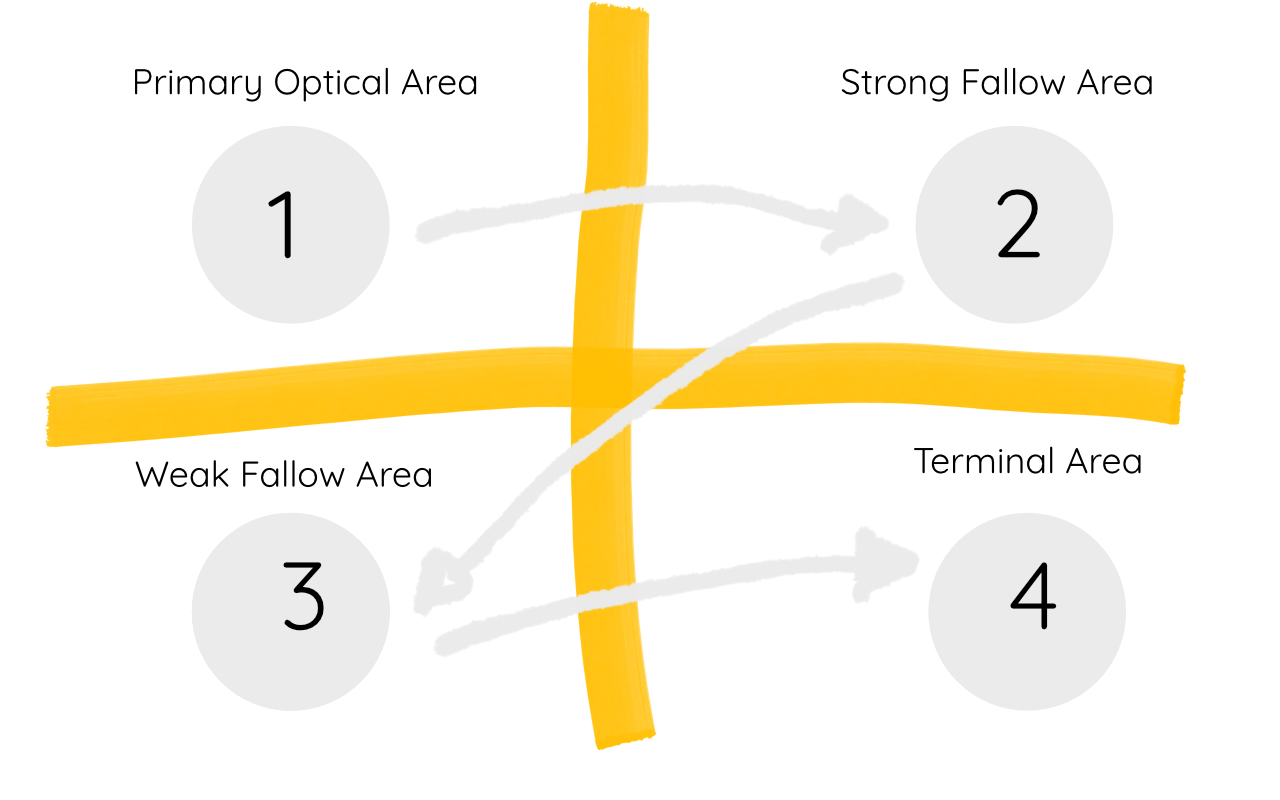
Read top-left to bottom-right
Conventionally, our culture automatically reads from the top-left to bottom-right. We can take advantage of this trait in dashboard design by putting the key, high level information at the top-left of the dashboard (for example KPI boxes). As the eye travels to the bottom-right, it is a natural place to put the visualisations that are at the lowest level of granularity (such as a scatter plot).
Thanks for reading! Any questions, please get in touch at vizi.education.
Other articles you may be interested in
4th November 2021 10 mins
Blog post
3rd December 2019 10 mins
Blog post
Peer to peer grading
Read more7th August 2019 5 mins
How to
Setting targets and metrics
Read more7th June 2019 10 mins
Blog post
Encouraging marking standardisation
Read more1st February 2019 10 mins
Blog post
Managing student wellbeing with data
Read more4th October 2018 10 mins
How to
Auto grade your assessments
Read more2nd August 2018 10 mins
How to
Using assessment breakdowns
Read more30th June 2018 5 mins
How to
Creating an assessment
Read more1st November 2017 5 mins
Blog post
6 steps to follow to create a good data environment for your school
Read more20th July 2017 10 mins
Blog post