The
 blog
blog
What makes a good viz? - Part 1
20th July 2017 | Chris O'Mahony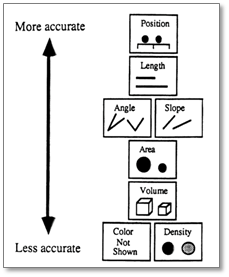
In this post we will be talking about the key principles of good data visualisation. A key goal at Vizi is to give educators the tools to draw insight from their data through data visualisations. By following these guidelines users can make the most of these tools.
Hierarchy of visualisation accuracy
The hierarchy of visualisation accuracy is a concept that explains the most efficient way to display data visually, for the brain to be able to process it. Usually, for most purposes, scatter plots, box plots and bar charts will provide the most accurate way of displaying data, due to their use of position and length to communicate information.
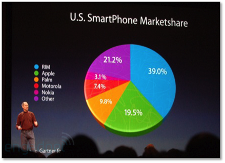
In particular, pie charts can nearly always be replaced with a bar chart to show proportions, or simply a table, unless there is a very specific use case for a pie chart.
Avoid 3D
It follows from the hierarchy that 3D is to be avoided at nearly all times. Most specialist data visualisation softwares have made a conscious decision to not allow 3D visualisations (as has Vizi!) within their software, as they believe they are fundamentally poor methods of displaying data.
Do not mislead
Not only can 3D be a relatively bad way of transmitting information, it can often be misleading. This distortion is due to the use of 3D images with a 2D medium and although it is usually inadvertent, it can be used to purposefully corrupt the information that it is trying to convey.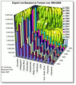
Be aware of ‘dazzling’ users
3D is not only difficult to use because of the perspective, but because of the dazzling array of dimensions it provides us with. The brain is easily distracted by colour and shape, as such visualisations should be as simple as possible whilst still conveying the core information. Any background images or colours should be carefully considered before adding, in the majority of cases they are simply unnecessary.
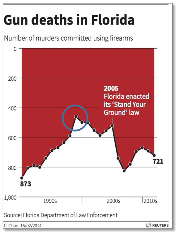
Follow convention
When creating visualisations, there are a few standard types that users resort to, bar charts, histograms, line charts, area charts etc. There is a good reason for this, they are fit for purpose and almost universally known and understood. When creating a visualisation that uses one of these familiar forms, stick to the convention of that visualisation.
The example area chart, looks like a standard chart. The immediate conclusion might to see the peak of Gun Deaths at the highlighted point (within the circle). This is not the peak however, but the lowest point as the y-axis has been flipped from the conventional orientation, with zero at the origin and higher values at the top.
At first glance, this presents a misleading image to the user as convention has not been followed. Convention can also rear its head regarding colours. You may be tempted to use Red and Green to differentiate between categories in your visualisation, but many people will automatically assume red means bad and green means good. Care must be exercised when using these colours to differentiate between categories.
Stay tuned for the second post on data visualisation good practice.
Chris.
Other articles you may be interested in
25th November 2021 10 mins
Blog post
15th January 2020 10 mins
Blog post
Data driven schools
Read more23rd October 2019 10 mins
How to
Track SEN cohorts
Read more7th August 2019 5 mins
How to
Setting targets and metrics
Read more7th June 2019 10 mins
Blog post
Encouraging marking standardisation
Read more4th April 2019 10 mins
Blog post
Machine learning in education
Read more1st February 2019 10 mins
Blog post
Managing student wellbeing with data
Read more4th October 2018 10 mins
How to
Auto grade your assessments
Read more2nd August 2018 10 mins
How to
Using assessment breakdowns
Read more1st November 2017 5 mins
Blog post